
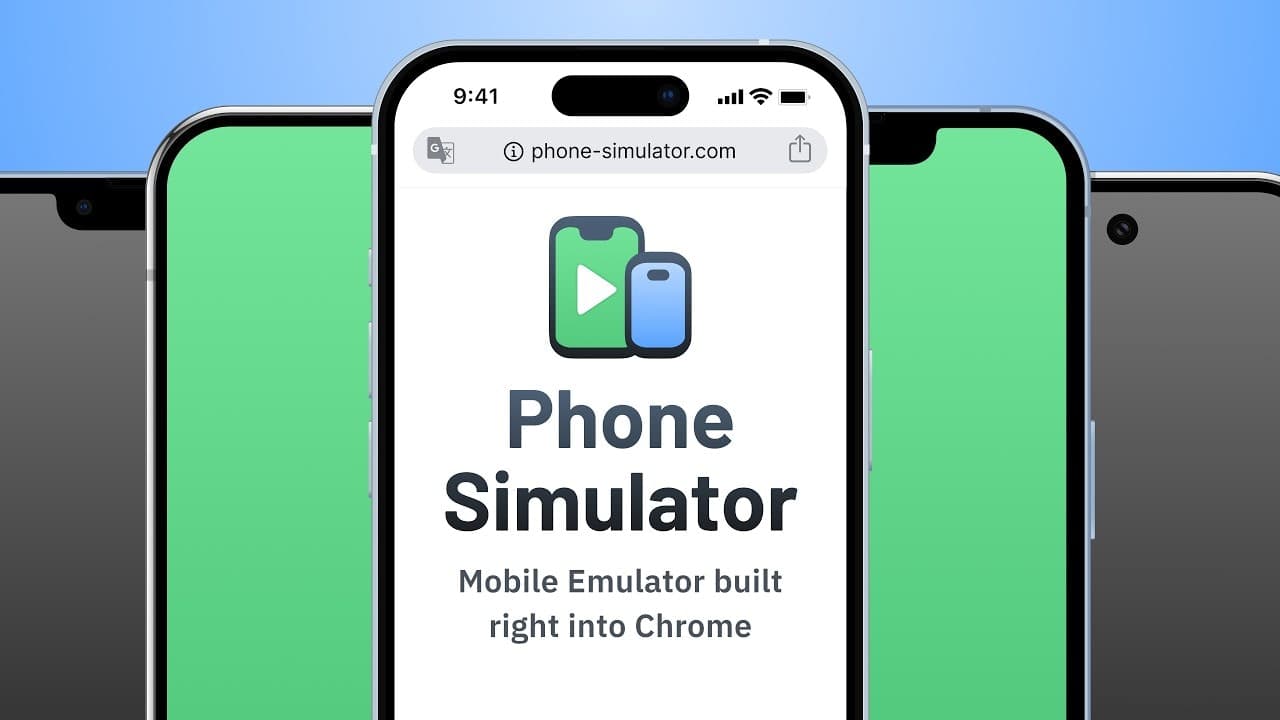
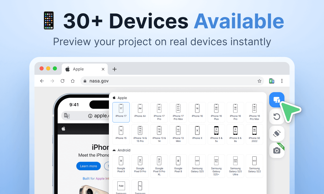
Stop guessing how your site looks on mobile. Phone Simulator lets you test on 30+ real device presets – iPhone 17, Samsung Galaxy, Google Pixel, iPad and more – directly in Chrome. Switch layouts instantly, rotate screens, test dark & light mode, and capture screenshots. No setup, no devices needed. Built for developers, designers, and QA teams.see more
Founder
Screenshots
About
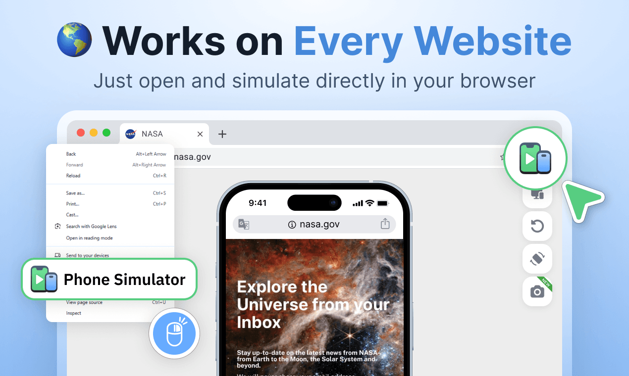
Are you tired of the guesswork involved in ensuring your website looks absolutely perfect across the vast landscape of mobile devices? Stop relying on vague assumptions and start testing with precision right where you work: inside your Chrome browser. Introducing the Phone Simulator, the essential tool designed to bring the real mobile experience directly to your desktop. This isn't just another responsive design toggle; it’s a powerful emulator that provides instant access to over 30 distinct, real-world device presets. Imagine being able to flawlessly check your layout on the latest iPhone 17, a cutting-edge Samsung Galaxy, or a standard Google Pixel, all without ever needing to pick up a physical phone or manage complex local setups. This immediate access saves countless hours and eliminates the frustrating lag between development and quality assurance, allowing you to catch layout inconsistencies, touch target issues, and display quirks before they ever reach your end-users.
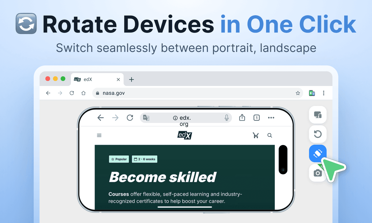
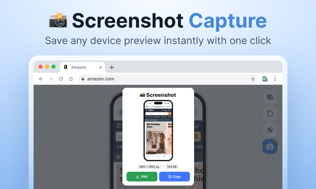
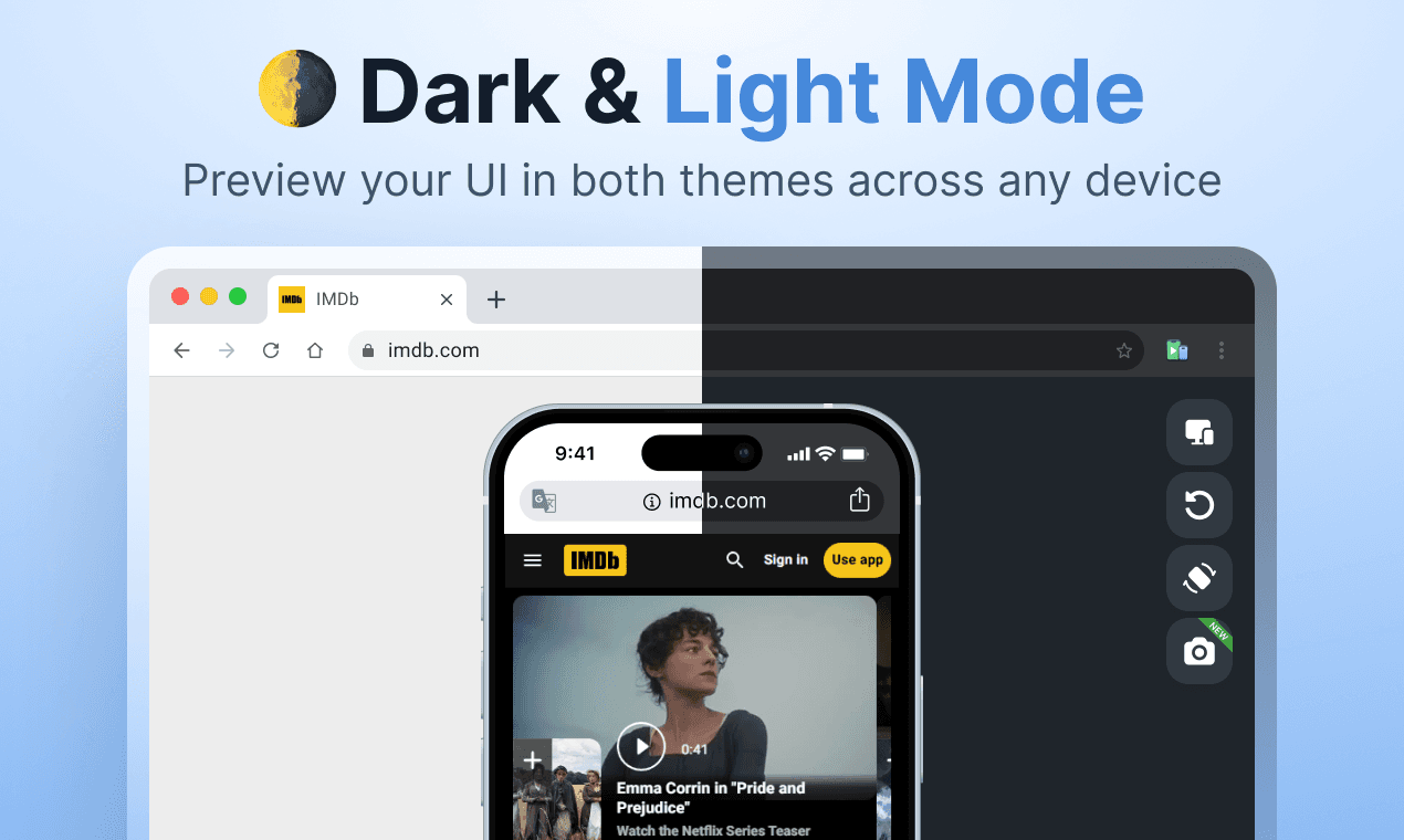
What truly sets the Phone Simulator apart is its seamless integration and robust feature set built for speed and accuracy. Developers, designers, and QA professionals will immediately appreciate the ability to switch between device sizes instantly, ensuring a fluid workflow as you iterate on your design. Beyond just size emulation, you can effortlessly rotate the screen orientation to test portrait and landscape views, verify how your styling handles different aspect ratios, and even toggle between dark mode and light mode to confirm your color palettes remain accessible and appealing in any environment. Furthermore, the integrated screenshot functionality means capturing proof of a successful test or documenting a bug is as simple as a click. It’s about removing friction from your testing process so you can focus purely on building exceptional user experiences that perform flawlessly, regardless of the screen they land on.
Ultimately, the Phone Simulator is an investment in quality and efficiency. By bringing the fidelity of physical device testing directly into your browser environment, you drastically reduce the overhead associated with manual device management and context switching. This tool empowers your entire team to validate mobile performance rapidly and confidently, leading to faster deployment cycles and a significantly better final product for your customers. Stop wondering how your site performs on mobile—know it, instantly, with the Phone Simulator right in Chrome.